What color is turquoise combined in clothes and interior
Basic knowledge of the science of color is what every woman needs to master, because to be able to combine different shades is necessary not only in the selection of clothes or makeup, but also in everyday life. For example, when dealing with interior design: where, no matter how here, there are always questions about what wallpaper to paste over the walls in the living room or with what color to combine your favorite shade? In particular, what makes a beautiful turquoise color work best?
What color is turquoise combined with?

For a more complete understanding of color, even at a basic level, it is recommended to get acquainted with the extended color wheel, where primary, secondary and tertiary colors are presented. Visualization will help to quickly make the necessary combinations, and also facilitates the process of studying such a complex science.
The turquoise color belongs to the category of tertiary hues, since it is intermediate between green blue, the latter of which is the primary color, the basis for many others, and green is in the group of secondary colors, being composed of yellow and blue. Thus, combinations for turquoise can come up with a lot: the shades of all 3 levels are subject to it. Depending on what effect you wish to achieve with a tandem or even a trio, you should select the rest of the "participants". According to the color circle, when combined according to certain laws by lines of colors, a variety of scales are born. Moreover, for this there are at least 3 ways, and several variations of each of them.
The simplest variant of the combination is through closely spaced shades, called related ones. For turquoise, these are blue and green, respectively, as forming it. Through such a combination, the most harmonious, soft and pleasant looking image is born, since all shades smoothly flow into each other. At the same time, you can choose the lead among these 3 shades, increasing its brightness and reducing the brightness of the others.
The next option, also not requiring from you the skills of a professional designer, is a combination of achromatic and monochromatic color: i.e. black or white is added to the pure color in a pair. In the case of turquoise, both of them are also permissible, but the tandem with black will create a mysterious, barely diluted image with radiance, and with white a gentle, refined atmosphere will be created. The turquoise-white pair is known for decorating Tiffani’s brand and is considered particularly successful for brides and everything related to the wedding theme.
Now it is necessary to return to the color circle again: a new principle of combining 2 colors is built on their opposite arrangement. This combination is called complimentary or disharmonious. You should not be afraid of the latter definition - the final image comes out holistic, and disharmony is born out of the discord of polarity in the color wheel. For turquoise, the opposite shade is coral: being next to each other, these shades will enhance the overall brightness and saturation, therefore, in general, such a tandem will always be full of energy. Even if you choose muted tones of turquoise and coral, as soon as they "meet", they will become cleaner, more noticeable.
We should also mention the last simple option, which is a stretch of a single color. In this case, it is the same turquoise, varying in saturation - from very dark to almost bleached. Such an idea does not work correctly everywhere, so you need to be able to apply it: in particular, this is hardly appropriate when designing the interior - the whole room in various shades of turquoise will tire your eyes; but it can be used for local design - for example, a bed, a sofa, etc.
How to harmoniously introduce Siberian color into the interior?

Since it was touched upon the application of color knowledge to the design of the premises, it is worthwhile to dwell on this question and analyze it in more detail. What will the turquoise color in the interior? How will it affect the psyche of who will be in such a room? And with what, in this case, to combine the selected shade to achieve the desired effect?
According to its temperature, turquoise color belongs to the group of cold shades, because it has a blue base. Consequently, the most harmonious combinations for him are those born among related to him by temperature: it is a semicircle from green (without admixture of yellow, i.e. green) to red-violet. This gamma is refreshing, but at the same time it contributes to a kind of “freezing” of metabolism and lowering blood pressure, if it affects the subconscious for a long time. Therefore, a person who is in the room, which is decorated in akin to turquoise tones, can feel a slight chill and cool. The idea of such a design is good for rooms that have windows to the south, because they overheat too much if the sun gets into them.
In order to neutralize such an obvious freezing effect, it is necessary to turn the cold gamut into a cool one, diluting it with several warm spots. It is not necessary for this purpose to include pure yellow or orange colors if you wish to maintain overall lightness and freshness: it is enough to resort to splashes of yellow-green, instead of pure green, or coral, replacing the classic red. In addition, the role is played by their share: to make the main coral and turquoise, occasionally complementing them with blue, violet and purple notes, and the general perception of the room is already fairly changed: the interior will have to rest and accumulate new energy. In addition, it is recommended to hold important conversations in rooms with a similar color range - it allows you to position the interlocutor to yourself.
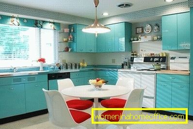
Not to mention the richness of turquoise and its companions in the interior: it will create a feeling of comfort and tranquility, if combined with lemon, salmon, mint, lilac. That is the same kindred and disharmonious tones, but highly diluted and faded. The room, made in a similar range, is filled with light and air, visually expands, and at the same time remains cool, fresh and clean. Especially recommended for turquoise color and related to him in the decoration of kitchens, bathrooms and any open areas - for example, loggias.
Turquoise in clothes - fashionable and bright!

With regard to the creation of fashionable images are absolutely the same rules of color as that for other spheres. In fact, when choosing a turquoise element of clothing for the rest of the ensemble, one should follow the same principles - the search for related or complimentary shades, combination with monochrome or natural colors. However, there are several nuances. In particular, the need to be kept in the framework of 2-3 colors in the overall image. For this reason, even moving along the corridor from related shades, you can pick up only 1-2 new ones to the turquoise color, and not to pick up everything that harmonizes with it. This means that the most basic combination is turquoise, green and blue.
At the same time, such a finding within the framework of similar shades is not always appropriate, therefore, stylists recommend compulsory dilution of pure color with monochrome. Consequently, in the image, where there is a turquoise detail of the wardrobe, there should be an item of black or white color, equal to it in area, and smaller ones - complementary. They, in turn, may be complementary to turquoise, or related. Moreover, disharmony also has its degree. For girls bright, not afraid to declare themselves, the tandem of turquoise with red or orange is ideal. If the desire to stand out is not so great, but I want to try the game in contrast, it is better to combine turquoise with purple or peach: this scheme gives a feeling of freshness, while pure complimentarity - energy and optimism.
The moment of the image temperature also deserves mentioning: if your appearance is absolutely warm, but you want to put on a turquoise color, you definitely need to add orange or scarlet things, and this should not be accessories. Those. their area should be equal to that which occupies a turquoise color in the ensemble. Girls with cold looks are lucky - they can make turquoise - the center of everything, having only diluted it with neutral tones: gray, gray-brown, beige. Such dilution is also required if the turquoise is clean, bright, saturated, in order to slow down these figures and balance the image.
Turquoise is the color of freshness and spring, light, sonorous, feminine. It can be combined with a large number of colors, and with the right approach - with any shade of the spectrum. Having studied the general rules, you will stop to suffer thoughts about what color combines turquoise in the best way, and create the most harmonious ideas in any area: from interior design to makeup.